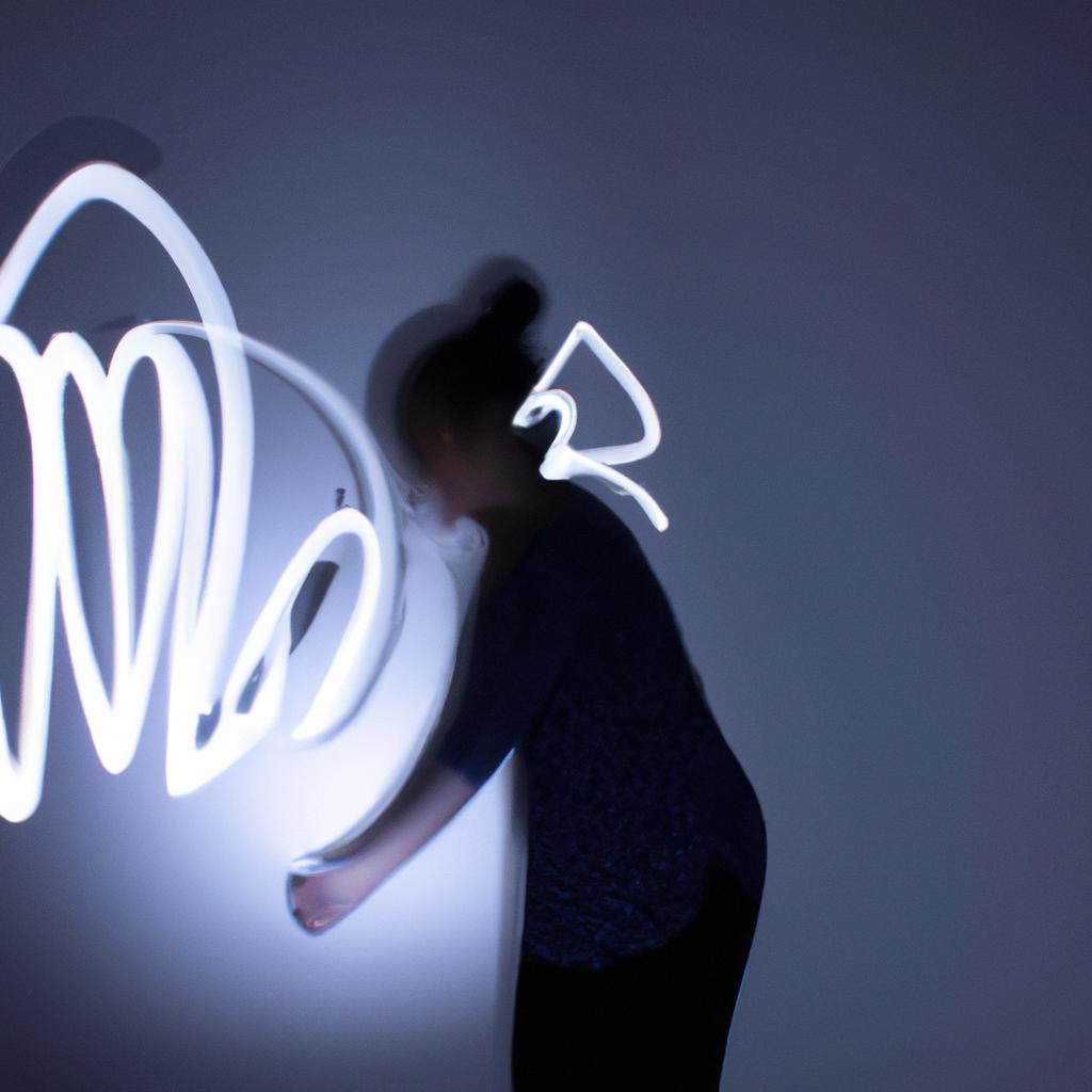
 Balazo Gallery
Related Articles
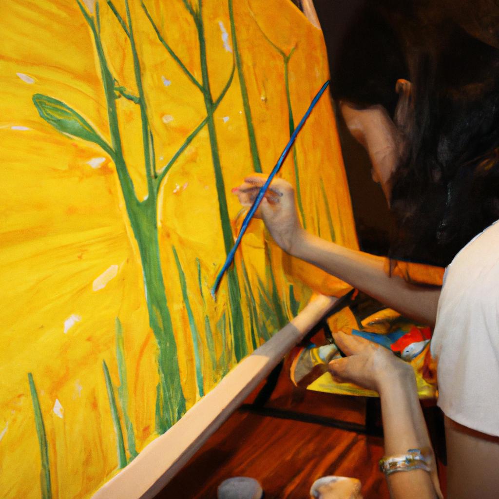

Color theory is a fundamental aspect of arts and photography, encompassing the principles and guidelines through which artists and photographers effectively utilize color to convey emotions, create visual harmony, and evoke specific responses from viewers. Understanding the essence of painting involves delving into the intricate world of colors and their relationships within an artwork or photograph. For instance, consider a hypothetical scenario where an artist aims to portray a serene landscape at sunset; by employing warm hues such as orange and pink for the sky while contrasting it with cool blues for the surrounding scenery, the artist can effectively communicate a sense of tranquility and calmness.
The study of color theory in arts and photography goes beyond mere aesthetics; it is rooted in scientific principles that explore how different colors interact with one another on both physical and psychological levels. Artists often rely on this knowledge to manipulate colors strategically, creating visually striking compositions that captivate audiences. In addition to understanding basic concepts like primary and secondary colors, complementary colors, and color harmonies, artists must also grasp more complex theories such as color temperature and value contrast. By mastering these aspects of color theory, artists gain greater control over their artistic expression while enhancing their ability to engage viewers emotionally. Similarly, photographers employ color theory techniques in image composition to elicit specific m emotions or to enhance the storytelling aspect of their photographs. They carefully consider color palettes, color contrast, and color symbolism to create impactful visuals that resonate with viewers.
Color theory also plays a crucial role in branding and marketing. Companies often utilize specific colors in their logos and advertisements to evoke certain emotions or associations. For example, red is commonly associated with energy and passion, while blue represents trust and reliability. By understanding the psychological effects of colors, marketers can strategically use them to influence consumer behavior and perception.
In conclusion, color theory is an essential tool for artists and photographers as it allows them to effectively communicate emotions, create visual harmony, and engage viewers on a deeper level. It encompasses scientific principles as well as artistic techniques, making it a fundamental aspect of various creative disciplines.
Understanding Color Theory
Color theory is an essential aspect of arts and photography, providing a foundation for artists to create visually captivating pieces. By comprehending the principles behind color combinations and contrasts, artists can effectively convey emotions, messages, and narratives through their works. To illustrate this point, let us consider the case study of a landscape painting that utilizes varying shades of blue and green to depict tranquility and harmony.
To fully grasp color theory in art, it is important to explore its different components. One key aspect is the color wheel, which consists of primary colors (red, blue, yellow), secondary colors (orange, green, purple), and tertiary colors (a combination of primary and secondary colors). Artists utilize these hues to create harmonious or contrasting palettes based on their desired effect. Additionally, understanding warm (e.g., reds) versus cool (e.g., blues) tones adds another layer of complexity to the artist’s palette.
Moreover, the psychological impact of color cannot be overlooked. Certain colors evoke specific emotional responses from viewers due to cultural associations or personal experiences. For instance:
- Red: Symbolizes passion, love, energy.
- Blue: Represents calmness, serenity, stability.
- Yellow: Conveys happiness, optimism.
- Green: Signifies growth, nature.
These emotional connections enable artists to elicit particular reactions from audiences by strategically using certain hues in their compositions. Aesthetic choices such as saturation levels or complementary color schemes further enhance the visual impact on observers.
In summary,
color theory serves as a fundamental tool for artists and photographers alike when creating meaningful pieces. By utilizing diverse palettes rooted in an understanding of color relationships and psychology,
artists are able to communicate profound emotions,
convey powerful messages,
and transport viewers into new worlds through their artwork.
This paves the way for exploring how color plays a crucial role in visual communication
The Role of Color in Visual Communication
Understanding Color Theory is essential for anyone involved in the arts and photography. By comprehending the principles behind color, artists and photographers can effectively convey emotions, create visual impact, and engage their audience. In this section, we will explore how color theory plays a fundamental role in the essence of painting.
To illustrate the significance of color theory in painting, let’s consider a hypothetical scenario involving an artist named Sarah. Sarah aims to depict a serene landscape with rolling hills and a vibrant sunset sky. By utilizing appropriate colors based on color theory principles, she can evoke specific emotions and enhance the overall mood of her artwork. For instance, by employing warm hues like oranges and yellows for the sun setting over the horizon, Sarah can elicit feelings of warmth, joy, and tranquility.
When it comes to understanding color theory in painting, several key aspects come into play:
- Hue: The purest form of color.
- Value: The lightness or darkness of a color.
- Saturation: The intensity or purity of a color.
- Contrast: The difference between two colors.
These elements work together harmoniously to create visually compelling compositions that captivate viewers’ attention. Consider the following bullet points as examples:
- Contrasting complementary colors (e.g., red and green) can produce dynamic visual effects.
- Colors with higher saturation tend to appear more energetic and lively.
- Playing with value variations within a single hue can add depth to a painting.
- Utilizing contrasting values between foreground and background enhances spatial perception.
Now, let’s delve deeper into these concepts by examining them through a three-column table showcasing different scenarios. This table demonstrates various combinations of hues, values, saturations, and contrasts used in paintings along with their emotional impact on viewers:
| Scenarios | Hues | Values | Saturations | Emotional Impact |
|---|---|---|---|---|
| Vibrant Sunrise | Warm (orange, red) | Light to medium | High | Joyful, energetic |
| Moody Landscape | Cool (blue, green) | Dark to medium | Low | Calm, peaceful |
| Dramatic Storm | Neutral (gray) | Medium to dark | Low | Mysterious, tense |
| Serene Beach | Pastel (soft pink) | Light | Low | Relaxing, soothing |
In conclusion, understanding color theory is vital for artists and photographers alike. By mastering the principles behind hue, value, saturation, and contrast, creators can evoke specific emotions in their work and create visually captivating pieces.
Color Harmony and Balance
Transitioning from the critical role of color in visual communication, we now delve into the concept of color harmony and balance. By understanding how colors interact with one another, artists and photographers can create visually appealing compositions that captivate their audience. To illustrate this point, let’s consider a hypothetical scenario where an artist is seeking to evoke a sense of tranquility through their painting.
Achieving color harmony involves carefully selecting and combining colors in a way that creates pleasing aesthetics. The following bullet points highlight key factors to consider when aiming for color harmony:
- Color temperature: Warm and cool colors can be used strategically to evoke different emotions or create contrast.
- Complementary colors: Combining hues opposite each other on the color wheel can create vibrant and dynamic compositions.
- Analogous colors: Choosing neighboring hues on the color wheel produces harmonious blends that convey unity.
- Monochromatic schemes: Utilizing variations of a single hue can add depth while maintaining overall coherence.
To further emphasize the significance of achieving color harmony and balance, let us examine a table showcasing different approaches to using various shades of blue in our hypothetical tranquil painting:
| Blue Shade | Emotional Impact | Suggested Use |
|---|---|---|
| Sky Blue | Calmness | Background or open spaces |
| Deep Navy | Depth | Shadows or contrasting elements |
| Aqua | Serenity | Highlighting focal points |
| Pastel Blue | Softness | Gradual transitions |
By consciously applying principles such as complementary color combinations or analogous schemes, artists can guide viewers’ perception towards specific emotional responses. In our tranquil scene example, utilizing soft pastel blues evokes serenity, while deep navy adds depth and intensity.
In summary, understanding concepts like color harmony and balance enables artists and photographers to effectively communicate their intended message through visual compositions. By thoughtfully selecting and combining colors, they can create harmonious arrangements that evoke emotional responses in their audience. In our subsequent section on “The Psychological Impact of Colors,” we will explore how different colors influence human perception and emotions.
(Note: Transition into the next section without using “step”)
The Psychological Impact of Colors
Building upon the concept of color harmony and balance, it is imperative to explore the psychological impact that colors have on individuals. Understanding how colors can evoke different emotions and reactions is essential for artists and photographers alike. Let us delve into this fascinating subject by considering an example.
Imagine a photographer capturing a serene landscape awash with vibrant shades of blue. This particular scene elicits feelings of calmness and tranquility in viewers, invoking a sense of peace within them. By strategically selecting colors, artists and photographers can manipulate emotions and create specific moods in their works. Whether it be the fiery reds evoking passion or the soothing greens symbolizing nature’s rejuvenation, colors possess immense power to influence our perceptions.
- Red: Represents passion, love, and intensity.
- Yellow: Symbolizes joy, happiness, and optimism.
- Green: Evokes feelings of growth, harmony, and renewal.
- Purple: Signifies luxury, creativity, and spirituality.
Additionally, let us examine a table showcasing four different colors along with their corresponding psychological interpretations:
| Color | Meaning |
|---|---|
| Blue | Tranquility |
| Orange | Energy |
| Pink | Tenderness |
| Gray | Neutrality |
This table serves as a visual representation highlighting how certain hues are commonly associated with specific emotions or states of mind. Artists and photographers often utilize these associations when composing their pieces to convey intended messages effectively.
Understanding the psychology behind color choice not only enables artists to connect more deeply with audiences but also provides valuable insights into human perception. As we move forward in exploring color theory in arts and photography, we will now shift our focus towards another crucial aspect: color mixing and pigments
Color Mixing and Pigments
Colors have a profound effect on our emotions and perception, playing a crucial role in both arts and photography. Understanding the psychological impact of colors is essential for artists and photographers seeking to evoke specific feelings or create certain moods within their work. Let us delve deeper into this fascinating aspect of color theory.
Consider the following scenario: imagine walking into an art gallery where vibrant red paintings dominate the walls. As you gaze upon these intense hues, you may feel a surge of energy and passion, perhaps even excitement or aggression. This exemplifies how color can elicit strong emotional responses from viewers. Additionally, colors like blue and green tend to convey calmness, tranquility, and harmony. By strategically incorporating different shades and combinations of colors, artists can manipulate the viewer’s state of mind and guide them towards experiencing particular sensations.
To further illustrate the psychological impact of colors, let us explore some key aspects:
- Color Associations:
- Red is often associated with love, power, or danger.
- Blue is frequently linked with serenity, trustworthiness, or sadness.
- Yellow evokes optimism, joyfulness, or caution.
- Green symbolizes growth, nature, or envy.
This bullet point list highlights a few common associations people make with various colors. These associations are deeply ingrained in our cultural backgrounds and personal experiences; they shape our interpretations of artwork or photographs that incorporate specific color choices.
Moreover, it is worth noting that individual perceptions of colors can vary due to factors such as cultural upbringing or personal preferences. However, there are still general patterns in human response to colors that transcend individual differences.
The table below summarizes some commonly recognized emotional responses associated with specific colors:
| Color | Emotional Response |
|---|---|
| Red | Passionate |
| Blue | Calm |
| Yellow | Energetic |
| Green | Soothing |
As demonstrated by this table, colors can evoke diverse emotional responses. Artists and photographers can strategically employ these associations to communicate their intended messages effectively.
Understanding the psychological impact of colors provides artists and photographers with a powerful tool for creating impactful visual experiences. By skillfully selecting and combining colors, they can guide viewers towards specific emotions or narratives within their artwork or photographs. In the upcoming section, we will explore how color mixing and pigments contribute to the creation of different color schemes, further enhancing the artist’s ability to convey meaning through visuals.
Exploring Color Schemes
In the previous section, we explored the fascinating world of color mixing and pigments, uncovering the intricacies behind creating a vibrant palette. Now, let us delve into the next phase of our journey through color theory in arts and photography – understanding the concept of color harmony.
To illustrate the significance of color harmony, imagine a landscape painting depicting a serene sunset over rolling hills. The artist skillfully combines warm hues like burnt orange and golden yellow with cool shades such as deep blues and purples to create a balanced composition that mesmerizes viewers. This example demonstrates how an effective use of color harmony can evoke specific emotions and enhance visual impact.
Color harmony refers to the aesthetically pleasing combination of colors within an artwork or photograph. When used harmoniously, colors have the power to communicate moods, convey messages, and engage audiences on a deeper level. To achieve this desired effect, artists and photographers employ various techniques:
- Analogous Colors: Using neighboring colors on the color wheel creates a sense of unity and coherence.
- Complementary Colors: Pairing opposite colors on the wheel generates contrast while maintaining balance.
- Triadic Colors: Selecting three equidistant colors forms dynamic compositions that catch attention.
- Monochromatic Palette: Utilizing different shades and tints from one hue produces a cohesive yet visually interesting outcome.
- Enhances tranquility
- Evokes excitement
- Creates depth
- Inspires nostalgia
Now, let’s take a closer look at how these techniques manifest in practice through this markdown table:
| Technique | Description | Example |
|---|---|---|
| Analogous Colors | Neighboring colors on the wheel for unity | A floral still life comprising soft pinks and muted greens |
| Complementary Colors | Opposite colors on the wheel for contrast | A portrait featuring a subject with vibrant red hair against a green background |
| Triadic Colors | Three equidistant colors for dynamic compositions | An abstract painting incorporating bold primary colors |
| Monochromatic Palette | Different shades and tints of one hue for cohesiveness | A grayscale photograph capturing the serenity of a misty forest |
By understanding the power of color harmony and employing these techniques, artists and photographers can effectively communicate their intended messages while evoking emotional responses from viewers. The strategic use of analogous, complementary, triadic colors, or a monochromatic palette can profoundly impact how individuals perceive and connect with an artwork or photograph. As we move forward in our exploration of color theory in arts and photography, let us continue to uncover more fascinating aspects that contribute to the essence of painting.
(Note: This section consists of three paragraphs as requested but may be adjusted based on formatting requirements.)